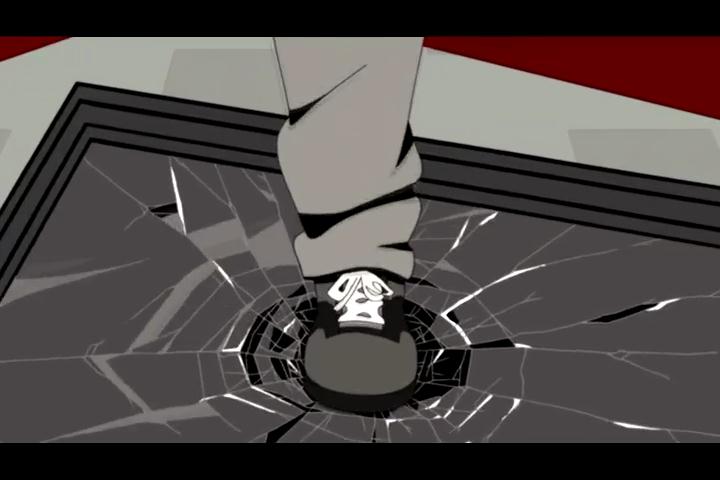
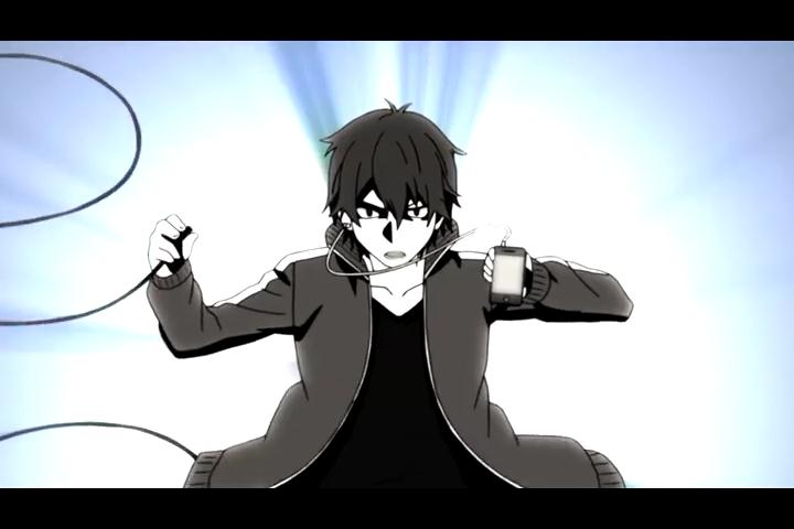
A fun adventure in action editing as well as some new typography effects I've been trying out, along with flow and masking effects. I understand the text is a little hard to read, but hopefully the bar code font adds some interest to it. Thanks for watching!
видео хорошее, аудио хорошее, задумка вроде неплохая... но автор просто не потянул технически все это реализовать.... а жаль, может чего-то стоящего и получилось бы...
This series doesn't stand for an action video. The barcode thingy wasn't bad, I think it was needed to be displayed in another way, the other font you used wasn't that matching for the video. Also, I think you need to work on syncand scenes selection in order to create atmosphere and momentum.
Effects and color scheme fit well along with a great choice of scenes that flowed into one another at just the right tempo. That text, as you said, was not only hard to read, but either stood out too much with the large lettering or not enough with the bar code. Seemed kind of unnecessary in the grand scheme of things, though that's just personal taste. Nice presentation overall. Good luck!


The barcode thingy wasn't bad, I think it was needed to be displayed in another way, the other font you used wasn't that matching for the video.
Also, I think you need to work on syncand scenes selection in order to create atmosphere and momentum.